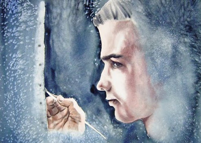
The Artist
15" x 22"
 This is one of the painting from my "archives". There are some reasons I like it and some I don't. I limited my palette to two colors in this one - indian red and indigo (with a touch of burnt sienna) and I like the limited color scheme. I also like the way the face and the hand turned out. What I don't like is that I got carried away with salt and spatter - there is WAY too much texture in this painting. I can see it now - couldn't see it then:(
11 comments:
Barbara, I love the effect that you achieved with a very limited palette. If you find that there is too much texture for your taste, you could always try cropping the painting and removing part of the left-hand side. How would that look?
Barb...While you may not like the textured vs. the smooth and realistic, I think I sorta like that! Don't ever revisit old paintings and apply your new-found techniques and tastes to those...it never is satisfying! I like this as is, as it is, so don't fret....
Christiane...Glad that you like the limited palette...I haven't decided about the texture yet - it is definitely more than I use now! Thanks for commenting.
Susan...You always have such down to earth, sensible remarks...so I am going to take them to heart and not fret! :) Thanks!
Gorgeous!! Oh I love the palette, I love all of it!
What an interesting color combination, Barb. And you know, the texture does not bother me at all, it seems okay because the subject is so clear. I like it!!!
JGR...thanks for the compliments - very appreciated!
Ginny...glad you are comfortable with the textures in this one and that you like the colors. Thanks.
I liked how you used your limited palette in this painting. Your face and hands did come out beautifully. I think the texture gives a feeling of magic in here. Thanks for being one of my followers, this really makes me feel good.
Nora,
Thank you for your wonderful comments. I am glad you are visiting my blog and I enjoy yours.
Barb
You could always go back in and tone down the hair and rest of the neck area, softening the texture along the way. I like the texture on the viewer's left side and the pose and the face and hand very much. And Happy Birthday!!!! (just read your current post).
Rhonda - that might be a thought - i have even considered cropping the right side - one of these days I may take some steps...
Thanks for commenting,
Barb
Post a Comment